


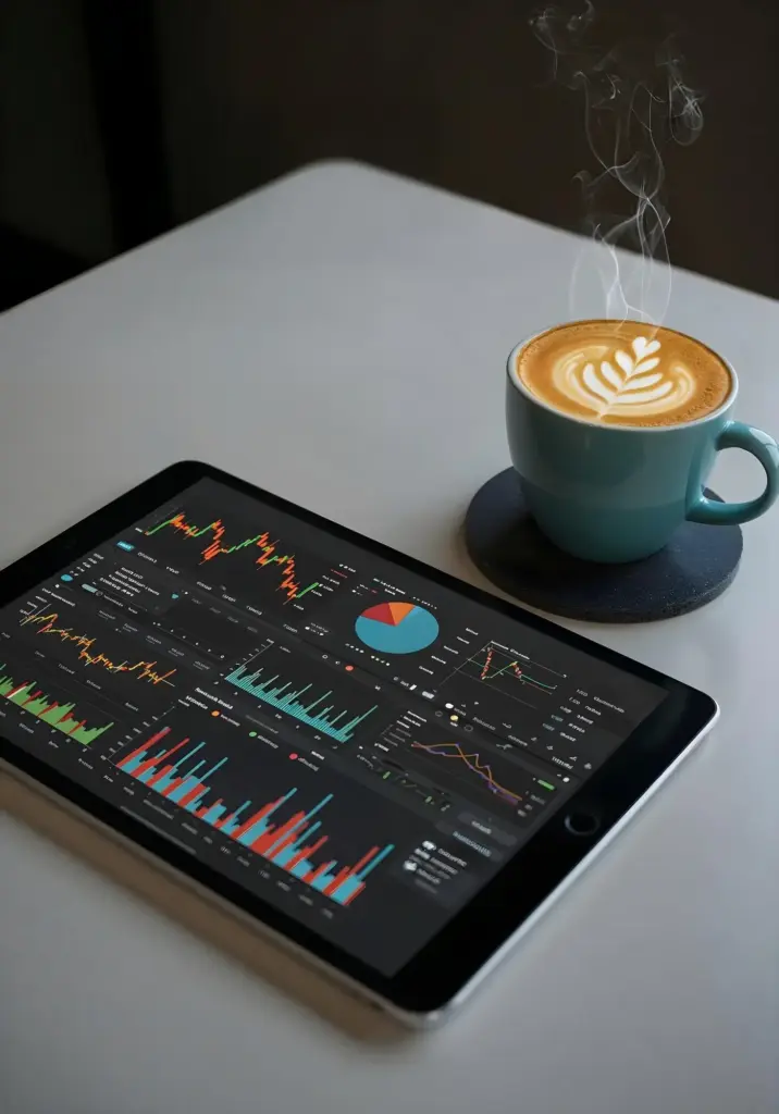






Design Your Own Investment Command Center With No-Code

Today we dive into Building Custom Investment Dashboards with No-Code Tools, turning scattered spreadsheets, APIs, and notes into a living cockpit for decisions. You will learn how to capture your goals, structure clean data pipelines, and assemble polished views that reduce confusion, spotlight opportunity, and protect focus. Expect practical workflows, relatable stories, and a repeatable approach that scales from a single portfolio to a collaborative, insight-driven workspace your future self will actually trust and use every day.

Clarity First: Goals, KPIs, and Decision Moments

Before placing a single widget, define the questions you want answered at a glance and the decisions they unlock. Are you watching drawdowns, cash runway, dividend coverage, or factor tilts? Set explicit time horizons, acceptable risk bands, and benchmark comparisons. Prioritize clarity and speed over novelty, and build from the most frequent decisions you face, not abstract hypotheticals. A dashboard that answers real, recurring questions becomes indispensable, while everything else becomes optional clutter.

Selecting a No-Code Stack That Fits Your Style

Choose a foundation that reflects how you think: relational tables for structured holdings, flexible notes for research, and a visual layer for storytelling. Consider Google Sheets or Airtable for data, Notion or Coda for narratives, and Glide, Softr, Retool-like builders, or Stacker for interactive apps. Connect automation via Zapier, Make, or Parabola. Favor tools with clear permissions, version history, and stable connectors. The best stack aligns with your brain and your team’s habits.

APIs Through Connectors, Sheets, and CSV Safety Nets

When possible, rely on official no-code connectors; they handle authentication and reduce fragility. For gaps, pair Google Sheets with IMPORTXML, Apps Script snippets, or uploader automations that place CSVs into a clean intake table. Standardize ticker symbols, currencies, and date formats immediately on arrival. Keep a staging area to validate rows before promoting to production views. This layered approach lets you blend convenience, control, and resilience while keeping manual steps transparent and reversible.

Scheduling, Caching, and Rate-Limit Awareness

Set refresh cadences aligned to decision frequency: end-of-day for long-term monitoring, intraday for tactical trading, weekly for research digests. Cache derived metrics to reduce repeated calls, and stagger workflows to respect provider limits. Log errors with context so triage is quick. Consider a small local mirror for high-traffic fields. Most outages feel tolerable when your dashboard degrades gracefully, shows last-known-good values clearly, and communicates when to expect fresh data without guessing.

Visualizations That Tell Investment Stories

Present less, mean more. Use aligned axes, clear legends, and consistent colors to reinforce understanding. Pair performance lines with drawdown charts, allocation treemaps with concentration alerts, and rolling volatility with Sharpe changes. Provide benchmarks alongside results, not hidden in another tab. Add context tooltips and one-sentence insights above charts. People remember stories that connect cause and effect, not decorative graphics that celebrate complexity. Aim for crisp narratives that inspire calm, timely action.

Analytics for Portfolios and Strategies

Aim for solid, explainable methods over exotic models. Implement time-weighted and money-weighted returns, max drawdown, volatility, Sharpe, and beta with transparent formulas. Compare against a relevant benchmark basket, not a single index when holdings differ materially. Add factor tilts, dividend yield trends, and cash drag analysis. Offer scenario toggles for rebalancing rules. Insights must be reproducible and teachable so teammates understand why a signal matters before they trust it with capital.

Automation, Alerts, and Collaborative Workflows

Turn insights into timely nudges. Use thresholds for drawdown alerts, allocation drift, or unusual volume, and route messages to email, Slack, or mobile push. Batch a weekly digest that summarizes changes and links to deep dives. Implement review steps for high-impact changes. Track who acknowledged which alert and what action followed. Collaboration flourishes when accountability is visible, notifications are meaningful, and silence is respected during calm periods to prevent alert fatigue.

Signals That Matter, Not a Siren That Never Stops

Define alert criteria rooted in your investment process: percentage drift versus target, variance from benchmark, or breaching a risk band. Set cooldowns and escalation steps. Include context in messages so recipients decide without logging in. Archive alerts with outcomes for learning loops. When alerts are infrequent, specific, and actionable, trust grows, and you avoid the numbness that follows a constantly blinking dashboard shouting for attention with little substance.

Human-in-the-Loop for Prudent Changes

Even the best automation benefits from review. Add approval flows for schema edits, provider switches, and formula updates. Require a brief change note with screenshots and expected impact. Roll out in a staging environment and schedule quiet-time releases. By designing friction where mistakes would be costly, you preserve agility elsewhere. People remain central to judgment, while machines handle timing, formatting, and repetition with a reliability humans cannot sustain during busy market cycles.

Share, Onboard, and Keep Everyone Aligned

Create a welcome tour that introduces navigation, update schedules, and the meaning of core tiles. Offer role-based views so analysts, advisors, and clients see what they need without distraction. Publish a change log and invite suggestions through a feedback form. Record short loom-style videos demonstrating new features. Communities form when contributors feel heard, and when new users gain confidence quickly because guardrails, documentation, and a sense of progress greet them from day one.

From Sketch to Live Dashboard: A Weekend Build Story

On Friday night, a paper sketch captured the essentials: benchmark comparison, drawdown, allocation, and alert panel. Saturday morning, Sheets ingested holdings and prices, Airtable tracked transactions, and Softr assembled views. Sunday, Zapier scheduled refreshes and emailed a weekly digest. By Monday, a small team used it to discuss rebalancing calmly. This story repeats because the pattern is teachable: small scope, trusted data, clear visuals, and automation that speaks only when needed.
Xarilumazoritoraloritemipiranari
Privacy Overview

This website uses cookies so that we can provide you with the best user experience possible. Cookie information is stored in your browser and performs functions such as recognising you when you return to our website and helping our team to understand which sections of the website you find most interesting and useful.